Friday, 25 March 2016

House Of Fraser

So after finally securing a job as a Visual Merchandiser, and not only that, but in the iconic Oxford Street House of Fraser... It's probably about time to post some examples of the work I've been doing!

My role is specifically amongst the homeware and kids departments- which suits me as i LOVE homeware. However, I do get to work with the other departments too as its quite a small team here. The work is always changing on a daily basis, and I never quite know what's coming next. There's quiet days when I'm able to just mooch about changing things, then some crazy busy days where sales need to be set up, displays changed, seasonal moves.... etc etc.

We follow guidelines, which admittedly is a little limiting in being able to use my own creativity, but its a real chance to learn the fundamentals and practice all I learnt at FRA, along with learning from people who have been working as VMs for longer than me! All in all so far its been a great learning experience. Im about three months in and can say I'm pretty happy with what I've been achieving so far, I just hope this continues and the work keeps busy!

Heres just a few examples of bits and pieces I've been up to since January :)


Simple bedding and soft furnishing cupboards. Based on colour.


Glass feature cabinet amongst dining, with season products, by brand/theme. 


Dinnerware Tables, by brand.


Seasonal set up- picnic range, into glass feature cabinet. 


Table of the month examples, including Valentines. 


Cushion wall


Kids Atrium- Display, Mannequins  and Merchandised Wall


Shabby Chic Brand- shelves and cupboard. 


Simple Dickins and Jones Wall


Mother's Day Feature Etigee 


Seasonal Atrium- New Homeware. 


                                                                        Bathshop Changes


Homeware Accessory Tables- Seasonal Set Up, all by story and/or brand. Product Groupings.


                         A few examples of work on the fashion floors.


The images are pretty basic as I literally change things constantly and usually forget! and most of these are done fast and then changed :) but just a selection of some things anyway!


:)


Monday, 17 August 2015

New Bedroom Art

New Additions to Bedroom Wall Art

17th August 2015


Taking the decision to slowly cover the back wall of my bedroom with various paintings, all of which will mostly be inspired by Dean Crouser's art work as I just can't get enough of his style! The stag head was the first to be completed, then the top bird soon after. After almost a year!!! out, and little time to paint, I've FINALLY been able to get back to it. So to start with I played it safe with the little butterfly, a simple addition and colour blast. Then.. I tackled the Wolf.


An animal I've never painted before and tend to stray away from- most of my paintings have been birds/flowers/butterflies in this style, so this was a challenge. I saw Crouser's version and loved it, and thought it would look pretty cool next to the stag. So I dived in and took it on. The outlining in pencil looked pretty awful, but I stayed committed and started painting away. Thankfully it all came together pretty decently and I'm quite happy with how its looking. It's not perfect, and I can tell Ive not painted for a while, but the little fella doesn't look too bad amongst the others.
Watch out for more additions to come!


Monday, 22 June 2015

Myriad Lifestyle Store


For my final term at the FRA, I took on an exciting, yet very extensive final major project. Following the same format as the 'Vector' project, I set about visualising and designing an entire store. From floor plans to fixture plans, concept pages to branding; This project covered all areas of Visual Merchandising, including a 3D window installation. The finished outcome, a beautifully bound suede cover, hardback book , with 211 pages of visual and written work. Complimenting this, a sketchbook and reflective log was kept. This final project caused stress and long nights, but ultimately I am really proud of the finished work. Developing all I've learnt on my course and challenging myself to try out new software and skills, this project was an exciting, self-driven few months of hard work. Graduation is approaching, so for now, its job hunting!!

The finished book. Printed and bound at student bookbinding. An expensive finish, but one I won't regret due to the beautiful materials used.


What's Inside? Here's a few examples of the types of things included in this project. A selection of the key types of things and my favourites!


A glance at the theme and concept of my store. 


Now onto the more visually exciting things!

 Floor Plans and Fixture Plans for both levels of the store. An extensive key was created to identify the unique fixtures. 

The next section of pages were dedicated to concepts and moods. Each department had a separate spread, where a mix of fixture designs, planograms, concept images and text were placed. Using Sketchup and Photoshop to create the main imagery. I had never before used sketch up, so this was both a challenge and an exciting tryout! 


I really enjoyed creating the fixture designs, and spent a large part of this project on this area. It was time consuming and tedious at times, but the outcome makes for a much more informative and clear store concept. I've pulled out a few of the main fixtures and planograms I designed, from clothing rails, lifestyle tables, shelving units and furniture layouts:


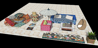
Furniture Layouts:


I also created a unique courtyard concept for this project, used for potential pop up events such as yoga and Pilates. Utilising the inspiring architecture of a Riad, it's inner courtyard was the perfect location for this 'pop up tent' idea. Designed and visualised on sketch up, the courtyard also has a balcony view and coffee hut, overlooking the artificial garden with large graphic screens. 


Branding for the Courtyard


A collection of branding applications was also created for my store concept, using mostly photoshop and sketch up again. Ranging from corporate branding to in-store applications, digital, media and advertising, mannequin displays and products. All were created to be themed and keep up Myriad's Moroccan, Bohemian concept.


The final part of this project was a 3D window, created to be a commercial display promoting a mix of coshing, lifestyle and homeware. A focus on strong pyramid groupings, colour balance and altering levels. The window was themed into oranges and blues, reflecting the store interior. Installed and taken down within a week, photographed, and window guidelines created.